Tuesday, October 4, 2011

DC New 52 Review: I, Vampire #1

This is my third review on the New 52 titles.


I, Vampire #1
Written by Joshua Hale Fialkov
Art by Andrea Sorrentino
Cover Price: $2.99


In a nutshell:
Typical Modern Vampire Story set in the DC Universe

Synopsis:
In this story we meet what looks to be the two main players in this series, Andrew, who looks to be the main protagonist, is a vampire who wants to peacefully coexist with humans, and his lover Mary who has a blood lust and wants to lead a Vampire Army to take over the earth. The couple has been together for four hundred years, since Andrew turned Mary into a vampire, and we're lead to believe that they had some sort of relationship before she was turned and that she had a very different nature to her when she was human. Mary seems to fully love Andrew for what he is, even loving that he opposes her plans for conquest. Andrew on the other hand has a more puritanical view of Mary, still holding on to the human she used to me and denying the blood thirsty vampire that she has become. The story flips back and forth between their last night together and the war between them that follows.

Why did I pick it up?
I originally wasn't going to. The cover art is good but it's such a popular style these days that it really didn't give me an idea that this was any different than most other comics out there. But the timing just lined up right as I've been sucked into HBO's True Blood series which just ended their fourth season, and I was feeling some withdrawal. When I paged through the comic at the comic shop I was pleasantly surprised to find that the art had a more realistic and moodier style than what was represented on the cover, so I gave it a shot.

The Good:
What makes this comic interesting is that, so far at least, is the external conflict is just a reflection of the relationship issues between these two lovers. True Blood fans with notice the similarities between Andrew and Bill Compton in that they both are in denial of their more carnal vampire natures and they both wish to peacefully coexist with humans. Mary you can imagine might be what True Blood's Sookie might eventually become if she was changed into a vampire, letting go of the innocence and repression and fully realizing her hunger and passion. Andrew is haunted by the pureness in his love for the human that Mary was and his feeling that he has tainted her. And he is torn because he realizes that Mary is a serious threat to the world that he cares about. It's not a new story concept to have enemies who are connected this way, but it is one that draws you in.

The Bad:
When characters like Superman and Wonder Woman are mentioned as potential enemies for Vampires to fight, it is distracting as this story doesn't really feel like it exists in the same world as superheroes. Early issues of horror/fantasy comics Swamp Thing and Sandman also acknowledged the existence of DC's superheroes and yet their Vertigo runs were totally self contained and it's not hard to get past in this story but it would not serve this comic well if eventually the stories crossed over with superhero characters.

Is it worth it?
If your a fan of modern vampire stories, this looks like it's going to be a good series to follow. The first issue has me committed to buying the next.

Sunday, September 25, 2011

DC New 52 Review: Action Comics #1

This is my second review of the current DC Relaunch. I want to start by saying, I'm not against reboots. My feeling is that reboots allow you to move iconic characters forward without losing the ability to return them back to the qualities that make them icons without undoing the stories that evolved them. My only issue with this one is that DC got a partial reboot just a couple years ago with Infinite Crises and with the average story taking almost six months worth of issues, I don't really think that got as fleshed out as much as it could have. I'm also a huge fan of the Superman work but Geoff Johns and Gary Frank, especially Superman: Secret Origin which was just released collected form this year, and I think it's a shame to throw that out when it's still so fresh. But I'm going to judge each comic individually on their own merits.


Action Comics #1
Written by Grant Morrison
Pencils by Rags Morales
Inks by Rick Byrant
Cover Price: $3.99


In a nutshell:
Superman, hero for the little guy!

Synopsis:
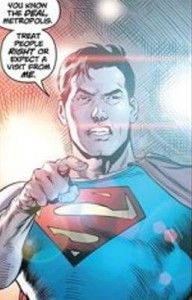
Despite his icon status, perhaps because of it, Superman is one of the hardest characters to write and make captivating. Part of it is because Superman is up on a pedestal and I would argue that he belongs there and that it's very possible to tell good stories using the character by tapping into the readers core fears, hopes, and inspirations, especially in a cynical age where we could use it. Perhaps part of the struggle writers have in doing it is because Superman's become this household name and corporate representation to everything Americana, which makes it hard to distinguish him and to give him an opinion or have him take risks. Well, this Superman breaks the mold, or at least the mold that we've come to think of him as. In truth when Superman first started in 1938 he has a little more swagger. In fact in his very first story in the original Action Comics #1 he breaks into the Governor's mansion and breaks all kinds of laws to stop a wrongful execution and beats up a wife beater. He's going to make sure that right is done and he's not concerned about breaking some rules to do it (after all, he's Superman, who is going to stop him?). Grant Morrison's current take on Superman appears to go back to these roots and this story starts off with Superman taking on corrupt capitalists and not in the most delicate way. Grant Morrison is about as close to a rock star as there is in comics and even though you know he's a bit of a provocateur he's definitely an A List writer.


Why did I pick it up
?
I love Superman but enjoy so few of his comics. Grant Morrison wrote All Star Superman which is one of my favorite comics of the last decade and even though everything I've heard about this series makes it sound completely different, this is the one book of the New 52 that appealed the most to me. Also, perhaps because I loathe Jim Lee's new costume design for Superman, the T-Shirt and jeans seems to work for me, which I wouldn't think it would.

The Good:
I was surprised how much I enjoyed this issue, definitely appreciating a Superman that has a progressive edge to him, especially as it seems there is more and more ingrained corruption in our society and the media and politicians have become so accepting of it. This Superman is a little radical in today's world and, from my perspective, that's not radical at all! This isn't my favorite take on Superman but this is a Superman I was to read and, so far at least, it's a Superman comic I want to follow. Art is important to me and Rags Morales has a style I can appreciate (lets put it this way, Superman's jeans actually look like jeans, not skin tight spandex with seams). This Superman is all new and yet looks classic. Superman isn't married to Lois Lane in this version which I know will upset some of the die hards the way it did with Spider-Man when his marriage was retconned, but it gives us a chance to get a little more romantic chemistry into the book and one of the good things about rebooting a series is that you can get to unload baggage without undoing it.

The Bad:
It's not Superman Secret Origin! No, seriously, for two decades John Byrne's Man of Steel set the ground work for Superman and when Geoff John's Secret Origin replaced it, it was such a good story, it's a damn shame that almost immediately it is undone, especially because I felt there was something magical about the Geoff Johns/Gary Frank Superman stories and I was hoping to see more added to them. That's less of a criticism of this story as it is praise for another story. The only concern I have about where this book is going is the glimpse we got of General Lane (Lois Lane's military father) and Lex Luthor who look like they're going to be the main antagonists of the book, and I'd really hate to see typical arch enemy/evil mastermind scheming pull away from the part of the story that I think is the more appealing. But we'll have to wait to see.

Is it worth it?
This and Justice League are the only books from the relaunch that I've noticed having a $4 cover price as opposed to the $3 price that most of the other books have (which in my opinion is already too much in the current economy especially because you can find most comics a year later on ebay for a fraction of the cost and with the collected editions becoming the more desired format). But, if $4 is something you're willing to spend on a comic book, this is the one to pick!

Friday, September 23, 2011

DC New 52 Review: Justice League #1

Since DC has relaunched their line this month with new #1 issues of their mainline titles as well as a (partial) restart to the history of their characters, I've been searching for reviews that could give me the scoop on the books I haven't been checking out. In doing so I found very few reviews of the ones that I have been checking out that have matched my own feelings on those books or the feedback from other fans at the comic shop I do work for. So I've decided to review the books that I had enough initial interest to pick up. This is the first of those reviews.


Justice League #1
Written by Geoff Johns
Pencils by Jim Lee
Inks by Scott Williams
Cover Price: $3.99


In a nutshell:
Where's the beef?

Synopsis:
My main problem with this comic is that I feel like I've read it already. I get that this book is supposed to appeal to new readers, but that doesn't mean there aren't new ways to introduce characters in comics and team them up so that the story will be fresh. The story structure is very similar to the first issue of All Star Batman and Robin and the changes seem to be for the sake of being more provocative but really, these ones are kind of tired cliches at this point, not just in comics but other popular media as well. The majority of the story is about Green Lantern meeting Batman, we get a glimpse of pre-origin Cyborg, and most of the characters in the comic aren't in it. We see that Batman is an outlaw, but we've seen that before so it's not really a shocking start and the dialog feels contrived. Besides the dialog, it's not that the story is bad, it's that it feels like half an episode and doesn't really give us an idea of what the Justice League is about and why we should care. Since the story starts with the captions explaining that it is five years in the past, perhaps what it could have used is a scene preceding what is now the opening scene that shows the entire team in an actions sequence in the present time so we get to see the characters on the cover that haven't made an appearance yet (which is almost all of them) and we get a sense that something actually happened in the comic.


Why did I pick it up?
Curiosity, primarily. The advance images with the costumes really put me off but Jim Lee and Geoff Johns are top talent. While I'm not a hard core DC fan, I do feel a connection with Superman, Batman, and Wonder Woman and the other "Super Friends" that I grew up with. So having really mixed expectations, I decided to take a risk on the chance that it might end up being an iconic story after all.

The Good:
This isn't Jim Lee's best art, but it's still Jim Lee with Scott WIlliams on inks (the under-appreciated member of that art team).

The Bad:
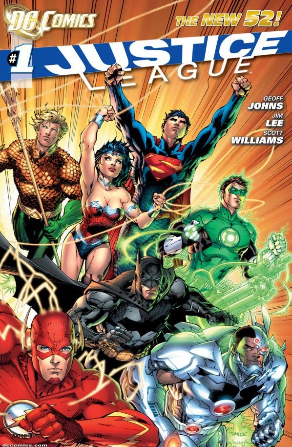
The costumes look dated, they seem to follow the trends of the 1990s with the only addition from the current trends in comics being a ridiculous amount of seams in patterns that don't make much sense. Superman has armor now for a costume and a ridiculous looking collar that reminds me of alternative versions of him we saw in 90s stories like Armageddon 2001 and the DC Year 1,000,000 Annuals. Of the DC trinity, only Batman has any story time, Superman doesn't show up until the last panel, and Wonder Woman isn't even in it which really doesn't give anything for the female reader who might be checking out the comic. The characters just seem in general to be snarky, confrontational, and pissy (kind of like fanboy posturing on internet message boards) which I don't find offensive but isn't interesting and has sort of become a cliche in modern comics. The cover is a week design, the character renderings on it and strange poses and angles are not examples of Lee's talent and the orange background cover and weak logo don't help. The characters that are supposed to be in a normal non-superhero setting looks like they're posed like superheroes and they are tensed up for battle, which might mean those kind of scenes are Lee's "Achilles Heal" as an artist (and perhaps one of the reasons Hush looked so awesome is because no other writer focuses on tailoring their stories to their artist like Jeff Loeb does). Geoff Johns has done so many amazing stories that were just home runs for me. Both him and Lee are A caliber talent. But they didn't bring their A game to this issue!


Is it worth it?
For $4 in today's economy, when most of the other books are selling at $3 with a story that feels incomplete, not at all! Which doesn't mean the complete story won't be good, but for a first chapter this really doesn't hook you. If the rest of the story arc delivers perhaps the trade would be worth it. But this single issue is not!

Sunday, April 3, 2011

My Favorite Posters: Phoenix Classic - 1986

DARK PHOENIX
By Rick Leonardi & Terry Austen


I had this vintage poster on my wall for many years as a kid but when I got out of highschool it was so beat up that I just threw it away. A few years back I went on an ebay spree of coveting old posters that I loved as a kid and just today I found I owned the poster, rolled in brand new condition, not even realizing that I had it after spending a couple of days searching the web for any image I could find of this (the only ones I have been able to find were either very small or in black and white). Since it bugged me so much that I couldn't find this, I'm putting it up here so anyone else who wants to find this has a source to draw from... truly one of the coolest X-Men images ever from the era that X-Men was actually cool (as opposed to overexposed and impossible to follow).

Monday, February 21, 2011

What this thing in Wisconsin is really all about... Elections Campaigns!


Scott Walker, Governor of Wisconsin: What a hypocrite! The guy is union busting by limiting the freedoms of unions that support state workers, but offers the ones who give him and other Republicans money, an out! This is soooo dirty and so telling This was never about the budget, it was all about hurting people who give money and support to the Dems! It's all about money and politics!

Saturday, January 29, 2011

Bring Back The Original Pizza Pit Devil Logo

Petitioning the Pizza Pit Franchise to bring back the orginal devil logo!

For those of us who grew up in Madison in the 70s and 80s, Pizza Pit WAS pizza! There is still nothing quite like a piece of greasy Pizza Pit pizza with that spicy sauce... mmmm (unless it's from one of the franchise locations that Pizza Extreme bought so they could run them into the ground into the ground by using Pizza Pit's name to peddle their own inadequate thin crust pizza (their stuffed pizza is excellent though). You can still count on the East Wash and Fish Hatchery locations to bring you the original recipe with pretty consistent quality.

Why was the logo changed to that, now out of date logo, that looks like it was designed for a neon sign? Were their religious groups upset about a devil for a logo? In Madison? It's not like devils aren't used playfully all over the place, especially not an issue in one of the most progressive cities in the country. If the Pizza Pit brand has been run into the ground by pour management, it's those of us who love it that lose. Let us suggest to the powers that be at Pizza Pit, that a step in the right direction is "bringing it home" and nothing is more symbolic to that than bringing back the logo we identified as "Madison's pizza", the pizza that was always at the Willy St. Fair back in the day, that had huge pizzas by the slice in the malls, that East High students still trek over to for their lunch, and that has that spicy sauce that no one can beat! There are other great pizzas in Madison, but nothing brings it home like Pizza Pit!


I recreated the logo in Adobe Illustrator off an image I found on the web (not that it isn't one of the simplest logos to recreate). If the Pizza Pit people are ready to submit to our demands and bring back the original devil logo, I will happily make it available to them if they don't have a vector EPS file.

Thursday, December 2, 2010

Review: Amazing Spidey # 649 (SPOILERS)

This review contains spoilers. It's also very fanboy heavy in the references.

I've considered myself the biggest original Hobgoblin fan for some time. I started reading comics in the Stern/Defalco 80s era and the Hobgoblin saga was one of the keys to my addiction. The Hobgoblin is his own villain, not just another goblin, very creepy and mysterious. Unfortunately, like with the Green Goblin, unmasking him changed a lot of his character. With the Green Goblin it made Norman Osborn overshadow the impish evil ambitious meddler, which in my opinion is where most of the appeal came from. With Kingsley however some of it was saved because of the use of the brother who was the wimpy Kingsley most of us were used to thinking of him as, so the real Roderick Kingsley simply took on The Hobgoblin's personality. It was still a bit of a letdown as a reveal considering that no one remembered or much cared about Kingsley by the time it was done, but it was cool to see the pieces that Stern laid out years before revealed.


The Hobgoblin is my favorite Spider-Man villain, period. So why was I not anticipating his return? Frankly, I think very few artists have done him justice. Only John Romita Jr. and Ron Frenz ever really made him look the way he should. Most draw his cape too long, they make his hood look weak, they don't effectively hide his face in shadows... and for me the art is a big part of the storytelling. And while I like Ramos in general (a little too cartoony for my tastes, yet very appealing for that style), I was not at all confident he would do the Hobgoblin justice. Also, frankly, I don't have faith that they won't wreck him like they did as soon as Tom Defalco was pulled off Amazing Spider-Man in the 80s. And I was really scared they'd kill him off and replace him.


Well, my fears about the art were unfounded. Ramos art is totally new yet feels like classic Hobgoblin. Probably my biggest disappointment with the story is that we won't see more of this Hobgoblin depicted.


Now that said, despite the (Spoiler) Hobgoblin's death in this issue (or maybe because of it), I think it was an excellent story. Boy, did it bother me, and that's good. In fact I haven't been this bothered since Kenneth killed Omar on The Wire, which of course was the perfect death for Omar (who in my opinion is one of the coolest characters on TV ever). This death was unexpected, sudden, and disturbing. And I realized that this a great story. It's classic Wild Bill Hickok. This was exactly what I didn't want to happen, and yet they pulled it off.

I mainly knew Phil Urich, the former Green Goblin wannabe who tried to be a hero, from the Spider-Girl comic. He was an okay character. I didn't have a particular emotional attachment to him but had nothing against him either. This definitely wasn't the same character so I pulled out the old Green Goblin series to check to see if this could be a legitimate evolution of the character and I have to say, it definitely could be. In that series he was definitely a poser, not totally stable or focused, and very self absorbed. The evolution in Spider-Girl is believable. He pulled it together and grew up. But the evolution here is also believable. There is no way the two characters could be the same person, but they both could have been rooted from what was established in that 1995 series. They're not the same continuity, so I see no conflict there or reason to get panties in a bundle.

I'm still bothered the real Hobgoblin is dead. I'm not crazy about other characters taking on the identities of others. It dilutes the characters and I think there is a limited life span when this concept is applied. But I think the new Hobgoblin is off his rocker enough to make him interesting for a while. While I think Ramos draws the original design better than his new design, I think the new costume works. I wish they'd lose the ears coming out of the hood, but this is a different character so maybe that's a way of characterizing that this isn't the cunning Hobgoblin that lurks in the shadows, he's the twisted maniacal one.


Here's why I don't just accept this story, but I like it, besides of course what I already mentioned; First off, all of us should know that nothing is permanent in comics. And The Hobgoblin will be back eventually and I would even bet that he will kill Phil Urich. In fact, I'm not so sure that Dan Slott doesn't intend for it to happen. In the scene of his death Hobgoblin did have thoughts that implied he was Roderick Kingsley because he's been there before. But there is no reason this couldn't be a stand-in, as Kingsley is known for using Hobgoblin stand-ins, or his brother Daniel, since he's Roderick's look-a-like (besides being bald) stand-in and was directly involved with supplying Kingsley his weapons which is why the Hobgoblin was raiding Osborn's at the time that he was murdered. It's implied by the head getting cut off that the Hobgoblin is in fact dead, but the mask is never removed. That almost has to be intentional considering everything we know about the Hobgoblin and his stand-ins. And remember, we thought we saw the Hobgoblin killed by a predecessor in a similarly unconventional fassion years before, only to come back and kill his replacement. You can't assume he's dead unless you see Roderick's face and even then you better check to make sure there isn't a hair piece there.


I'm looking forward to the rest of this story playing out in the next two issues.